Foundations That Feel Effortless

Luxe neutrality begins with nuance: off-whites touched by mushroom, sand, or ivory; quiet greiges with green or violet whispers; and taupes that shift from crisp morning light to dusky evenings. Test on large primed boards, move them around the room, and watch how finishes alter depth. Layer compatible temperatures, protect softness with low saturation, and let subtle contrast guide the eye. Share your favorite near-white discoveries and what surprised you under different bulbs or seasons.

Decoding Undertones Without Guesswork

Line swatches beside a true gray card, then place them near fixed elements—floors, stone, or upholstery—to reveal hidden warmth or coolness. Compare at least three candidates at once to let differences emerge. Photograph morning, noon, and evening light. If a neutral turns unexpectedly pink or green, consider neighboring materials. Undertones behave relationally, so build harmony from the largest surfaces downward, and journal observations to avoid expensive repaint cycles and second-guessing.

Sheen and Surface: Finish Changes Everything

Matte softens walls and swallows glare, while eggshell bounces a hush of light without reading glossy. Limewash and Roman clay add mineral movement that feels ancient yet minimal. On trim, satin sharpens edges for elegant contrast against flat walls. Test cleaning needs in high-traffic zones, and remember that higher sheen can intensify color perception. Pair gentle finishes with textured fabrics so the sensory balance feels intentional rather than sterile or flashy.

Near-Whites with Character, Not Chill

Choose near-whites that carry faint notes of oatmeal, linen, or bone rather than stark brilliance. These shades flatter skin tones, soften edges, and accept layered accents gracefully. Avoid bluish whites in north-facing rooms unless counterbalanced with warm textures. Paint ceilings a whisper warmer to prevent a clinical cast. If cabinetry must stay bright, warm the walls slightly and add tactile textiles. Invite readers to share swatches that finally made their spaces feel calm.

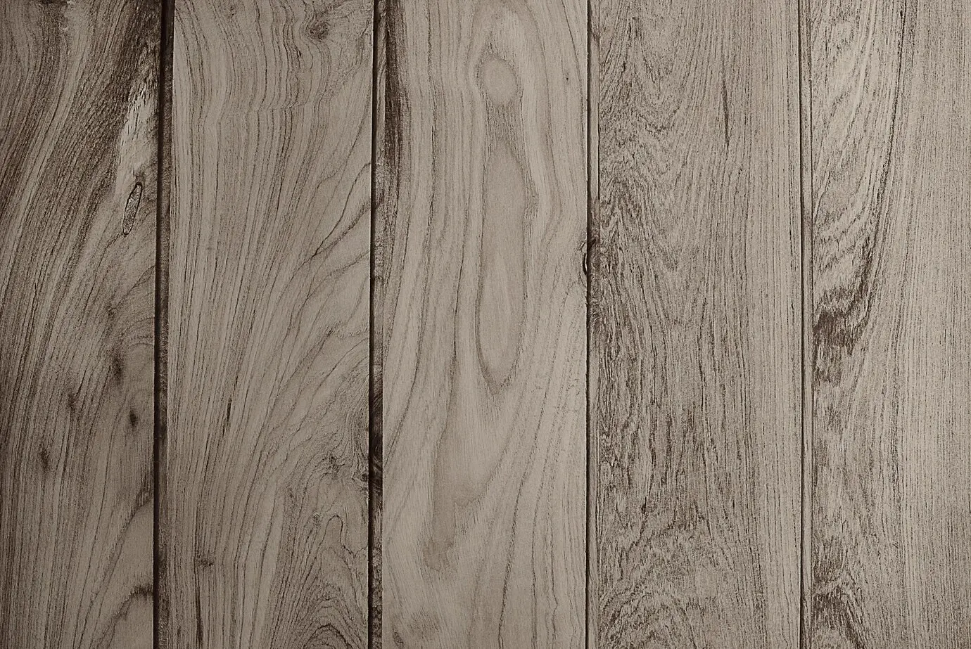
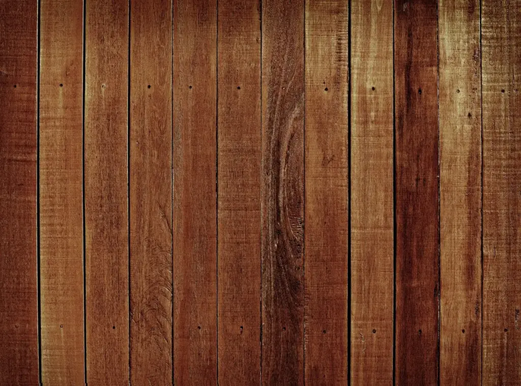
Texture First: Quiet Drama You Can Feel

Texture adds soul where color retreats. Stone with honed finishes, woods with open grain, and metal with softened patina create a chorus that speaks softly yet resonates. Let one hero texture lead, while others support with restraint. Mix smooth plaster with boucle, linen with mohair, and sisal with wool. The room should invite touch, reward proximity, and sound softer underfoot. Tell us which textures made your home feel instantly calmer and more grounded.

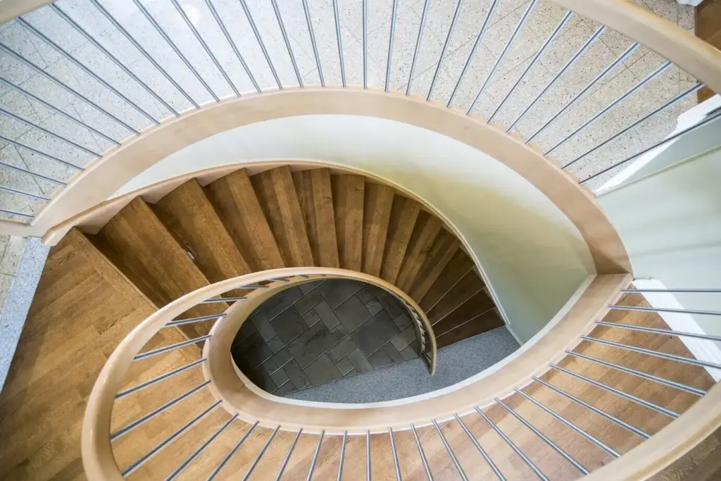
Light: The Silent Partner of Every Palette

Light edits color all day long. North-facing rooms cool undertones, south-facing exposure can bleach delicate pigments, and mixed artificial bulbs may fight your careful paint selection. Map your light, layer sources, and choose lampshades that diffuse without yellowing. Dimmer switches create evening intimacy, while warm-dim LEDs shift toward candlelight after dusk. Share your lamp placement breakthroughs or the moment you realized a shade swap made everything finally make sense.

01

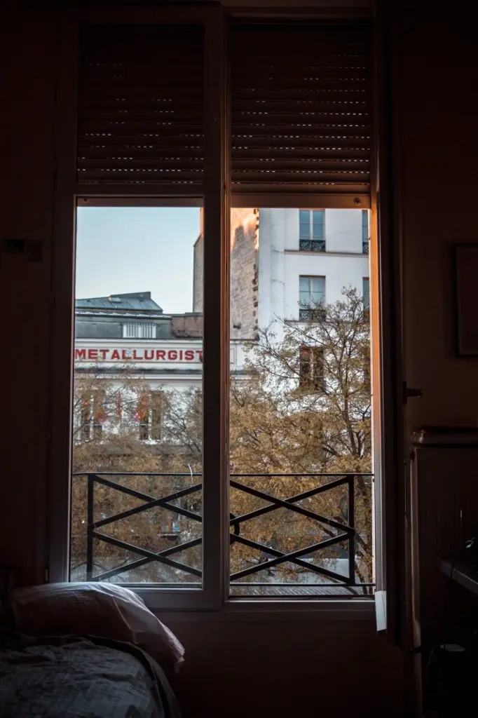
Mapping Daylight to Guide Your Choices

Track sun paths for a week, noting glare spots, shadow pools, and reflective surfaces. Use large sample boards that travel with the changing light, photographing at repeatable times. If a hue dies at midday, nudge warmer. When glare flattens texture, introduce sheer drapery and matte finishes. Light is dynamic; your palette should flex gracefully. Post your before-and-after shots to show how awareness transformed not just color, but mood and comfort.

02

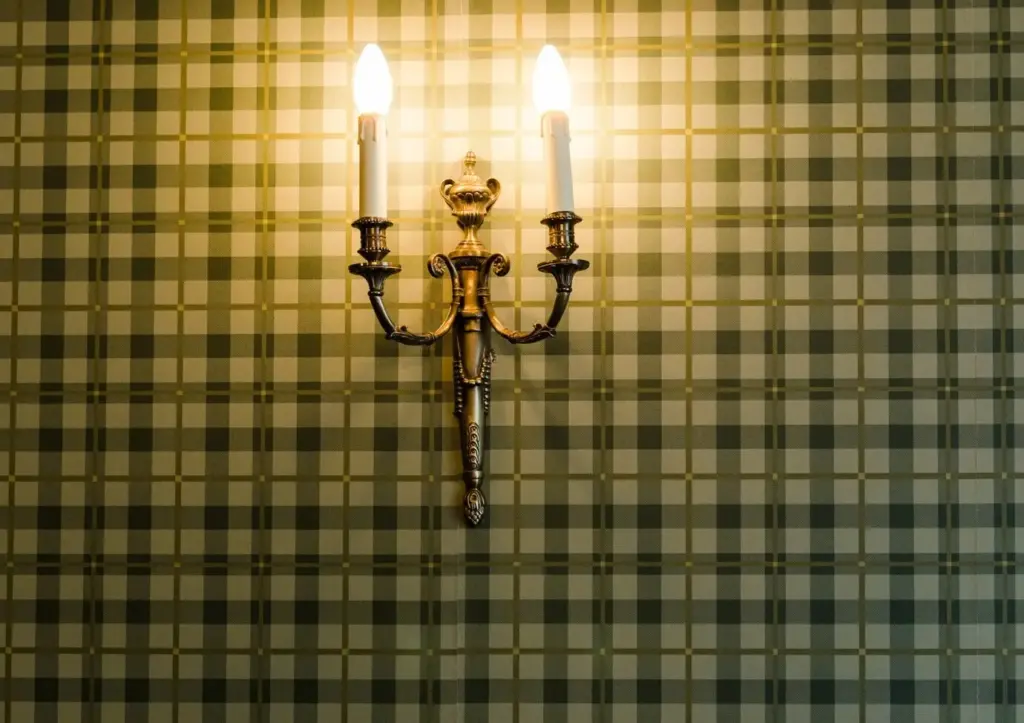
Evening Layers: Lamps, Sconces, and Warm Dim

Combine a low-glare floor lamp with opaque shade, art-level sconces at eye height, and a small table lamp to paint corners with glow. Choose bulbs around 2700K for intimacy, and experiment with warm-dim technology that softens temperature as brightness lowers. Avoid blue-heavy light after sunset to protect circadian rhythm. Share favorite bulb models, shade materials that flatter texture, and layouts that transformed cavernous rooms into hushed evening retreats.

03

Reflections, Shadows, and True Neutral Balance

Mirrors, lacquered trays, and pale floors bounce light, while heavy drapes and deep upholstery absorb it. Aim for a gentle dialogue where reflections open space but never glare. If shadows feel gloomy, lighten adjacent surfaces rather than introducing brighter bulbs. Remember that quiet luxury relies on serenity, not spectacle. Tell us how you balanced reflective accents with calm textures, and whether a single mirror repositioning changed everything about your palette’s perception.

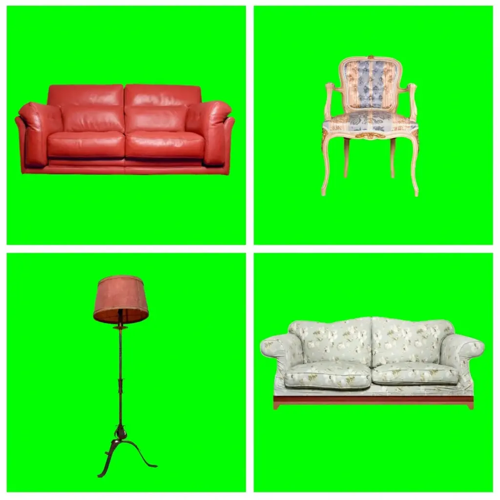
Accents That Whisper, Not Shout

Restraint magnifies significance. Introduce color through micro-accents—ink, espresso, lichen, or oxblood—in tiny proportions that punctuate rather than dominate. Let art, books, and botanicals carry richer notes. Choose velvety finishes, aged frames, or ceramic glazes that feel lived-in. When you remove one item and the room still sings, you’ve calibrated well. Tag us with a snapshot of your softest accent that made the largest, quietest impact.

Stories from Real Rooms

Experience proves principles. From compact city nests to layered heritage homes, quiet luxury flourishes when neutrals, texture, and thoughtful light collaborate. These snapshots share lessons learned, mistakes forgiven, and moments when restraint finally felt complete. As you read, imagine your own spaces evolving. Add your story below, include a palette list, and invite feedback—our community thrives on generous, respectful critique and the courage to edit bravely.

Sourcing with Integrity, Caring for Longevity

Quiet luxury prioritizes provenance, durability, and touch. Buy fewer, better pieces; choose finishes that improve with age; and support makers who craft responsibly. Maintain surfaces so patina reads intentional, not neglected. Budget strategically by investing in foundational items and saving on accents. Share your trusted resources, favorite eco-friendly paints, and care rituals. Subscribe for checklists, supplier spotlights, and seasonal maintenance reminders crafted to protect beauty without anxiety or excess.
Rolitafokozu
Privacy Overview

This website uses cookies so that we can provide you with the best user experience possible. Cookie information is stored in your browser and performs functions such as recognising you when you return to our website and helping our team to understand which sections of the website you find most interesting and useful.