Start with Ambient: The Calm Canvas

Ambient light establishes the baseline the eye reads first, softening contrast so textures and colors breathe. We’ll explore indirect coves, wall-washing that lifts ceilings, and broad-beamed pendants that disappear into the composition. The goal is even luminance without flatness, shaped by shielding, dimming, and reflectance. With thoughtful placement, circulation feels intuitive, architectural lines stay legible at night, and glare fades, allowing furniture, art, and conversation to remain the true focus while the space gains quiet depth and gentle, reassuring continuity.

Ceiling Planes and Hidden Glow

Concealed coves, shallow slots, and perimeter grazes can make ceilings seem lighter and rooms feel taller without demanding attention from fixtures. Aim light upward, bounce off matte white or pale tones, and mind cut-off angles to prevent sparkle in sightlines. Pair dim-to-warm or 2700–3000K sources with smooth low-end dimming, so twilight moments feel natural. Test at night, then tune levels until people, not hardware, become the brightest elements, creating visual comfort that quietly invites conversation and slow, unhurried breathing.

Wall-Washing for Perceived Brightness

Even, scallop-free wall-washing increases perceived brightness more efficiently than flooding the center of a room. Use asymmetric optics or spaced linear grazers, keeping consistent offsets to avoid hot bands. When walls read bright, the eye relaxes and ceilings appear higher. This strategy is invaluable in narrow halls and compact living spaces, where uniform vertical light makes architecture feel gracious. Combine with discreet dimmers to adapt for art, seasonal decor, and evening rituals without breaking the restrained character you worked to establish.

Balancing Luminance and Shadows

Absolute uniformity flattens mood; delicate shadow is essential for depth. Calibrate ambient levels so darks remain readable yet gentle, using reflectance-aware calculations or quick light-meter checks on site. Keep luminance ratios between primary surfaces comfortable, avoiding harsh jumps that trigger squinting. Blend broad ambient with subtle perimeter shade, letting doorways glow softly while corners retain whispering contrast. This balance supports relaxed eyes, flattering skin tones, and a refined calm that feels considered, not staged, across ordinary evenings and occasional gatherings.

Task Lighting with Poise

Purposeful light where hands work and eyes focus should feel precise, quiet, and never clinical. Choose shielded optics, accurate color, and thoughtful switches close to activity zones. We’ll explore under-cabinet lines that conceal hotspots, desk lights with flexible arms yet disciplined beams, and reading spots that honor shared spaces. Treat angles and heights as choreography, protecting sightlines while delivering clarity. When task light is calm and controlled, work feels effortless, counters stay inviting, and the whole room retains an unhurried elegance.
Combine diffuse under-cabinet strips for shadow-free chopping with narrow-beam pendants that punctuate the island rhythm without overwhelming it. Keep sources hidden behind lips or frosted lenses to avoid diode dots. Ensure color rendering lets produce look appetizing and wood tones stay honest. Separate controls for prep and dining scenes allow quick mood shifts from lively cooking to relaxed conversation. Layer a dimmed cove or soft wall-wash to hold the room together, ensuring lively tasks coexist with understated, gracious ambiance.
Articulate arm lamps with high-CRI LEDs and 3000–3500K color help documents read crisp, while a modest ambient halo prevents tunnel vision. Aim for low glare, tight cut-off, and gentle vertical fill for video calls. Keep the beam off screens and polished surfaces to avoid sparkly distractions. Add a secondary, warm accent behind you to create depth on camera. When work stretches late, smooth dimming and a cup of tea often outpace caffeine, maintaining clarity without sacrificing your evening’s quiet cadence.
Choose pin-spot heads or recessed micro-adjustables with strong cut-off, mounted slightly forward of the pillow line to avoid face shadows. Warm color and a dedicated dimmer respect night sensitivity, while a tiny beam keeps pages clear without waking anyone nearby. Integrate a quiet switch or capacitive touch on the headboard, and route wiring cleanly for timeless installation. Add a low-level night path to the bath, ensuring safe movement and an unbroken, serene mood that carries from dusk until dawn.

Art that Breathes

Picture lights and adjustable recessed accents excel when color accuracy is high and spill is controlled. Test angles to avoid glass glare and align beams slightly larger than the artwork for gentle falloff. Consider 2700K for warm palettes, 3000–3500K for contemporary tones. Use memory scenes to honor daylight, then softly elevate in evening hours. The result should feel like the art woke up, not like a gallery moved in, sustaining intimacy while honoring craft and story embedded in each frame.

Texture on Stone and Wood

Grazing from close offsets deepens relief on brick, limestone, and carved wood, but too much intensity can become theatrical. Start low, increase gradually, and test at multiple distances to find the sweet spot between shimmer and comfort. Matte sealers and lower sheen finishes prevent harsh sparkles. Pair with a calm ambient backdrop so textures read as one voice in a larger composition. As fingertips trace surfaces, the light should feel like a soft sentence finishing a thought, never an exclamation.

Mirrors, Metal, and Subtle Sparkle

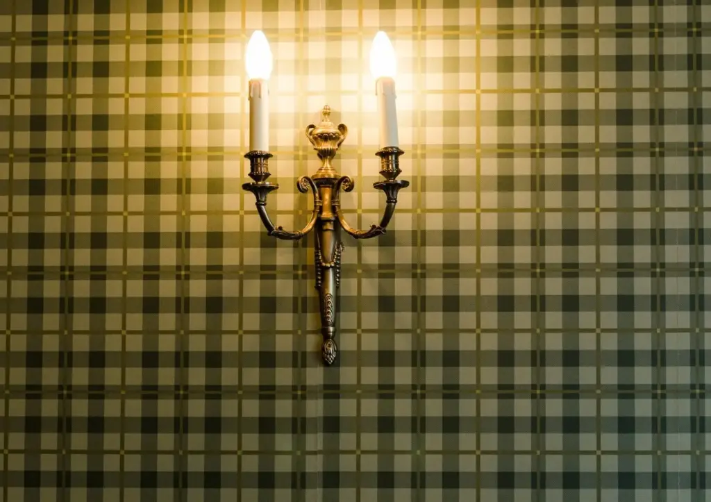
A small, controlled sparkle energizes quiet rooms when used sparingly: a prismatic pendant over a console, a tiny refracting sconce near a mirror, a discreet LED in a display shelf. Keep output modest, color warm, and placement away from direct sightlines. Let reflections multiply the effect without dominating. These touches lift evenings, complement candlelight, and make guests smile without knowing exactly why. Elegance resides in restraint; one well-placed glimmer can animate an entire composition with effortless grace.

Color Temperature, Fidelity, and Circadian Ease

Color choices shape emotion. Warmer tones soothe, cooler neutrals clarify, and accuracy keeps materials honest. Favor high-CRI or, better, strong TM‑30 Rf/Rg performance so woods, textiles, and skin tones appear natural. Use dim-to-warm for evenings that echo candlelight, while daytime scenes lean slightly cooler near windows. Calibrate transitions gently to respect circadian cues without rigid schedules. When color and brightness align with daily rhythms, rooms feel like companions—supportive in work hours, restorative after sunset, and beautifully consistent throughout seasons.

Dimming, Control, and Technology that Stays Quiet

Control should disappear into routine, not dominate it. Choose reliable dimming—trailing-edge, 0–10V, or DALI—with compatible drivers to avoid flicker and hum. Favor scene-based wall stations with a few meaningful options over app clutter. Where appropriate, add Thread or Zigbee bridges carefully, protecting privacy and stability. Design fallbacks that still work when Wi‑Fi sleeps. Keep wiring labeled, panels tidy, and interfaces understated. The reward is fingertip elegance: one press for supper, another for cinema, a third for late-night conversation.

Scenes that Simplify Evenings

Create three to five scenes that cover ninety percent of life: Welcome, Cook, Dine, Relax, and Late. Each balances ambient, task, and accent so transitions feel like exhaling, not switching modes. Use gentle fades to avoid attention-grabbing jumps. Keep labels clear for guests and program double-taps for favorites. Revisit seasonally, adjusting for earlier sunsets or festive gatherings. When scenes mirror routines, everyone adopts them effortlessly, and the home communicates in a calm, intuitive language that supports the night’s intentions.

Invisible Smartness, Real Reliability

Place sensors where they serve, not surprise: low-level guides for hallways, presence detection for closets, but manual control for living spaces to preserve ceremony. Cache automations locally to survive internet hiccups, and choose platforms with long-term support. Hide hubs neatly, ventilate enclosures, and document every circuit. The smartest upgrade is often a clean, labeled panel. By making intelligence invisible and predictable, the house feels gracious—responsive when needed, silent when not—so sophistication reads as ease rather than conspicuous gadgetry.

Future-Proof Wiring and Drivers

Even minimalist homes benefit from generous conduit and accessible junctions. Specify quality LED drivers with documented dimming curves and field-replaceable parts. Keep loads grouped logically to enable independent control of ambient, task, and accent layers. Plan spare capacity for a future art wall or library nook you have not imagined yet. With this foresight, upgrades become painless and surface finishes remain pristine, preserving the subtle character that took so much care to cultivate in the first place.

Matte Finishes that Tame Brightness

Matte paints, honed stone, and brushed metals keep reflections low, letting you run slightly brighter ambient levels without glare. This latitude makes dimming more expressive, because you can dial scenes down for mood instead of necessity. Avoid high-gloss near eye level unless you want sparkle. Coordinate sheens across adjacent planes so no single surface steals attention. The result reads collected and calm, as if daylight has been distilled into a soft, steady presence that flatters every material choice.

Metal, Glass, and Fabric Shades

Shades behave like instruments: metal focuses and shields, glass shares sparkle and spread, fabric warms and calms. Selecting the right one for each moment changes everything. A linen drum under-dimmed becomes evening’s heartbeat; a clear globe, placed carefully, adds a wink. Line translucent materials to hide bulbs, choose opal glass to soften LED points, and test dimming to reveal personality. In a restrained composition, the right shade elevates mood while staying obedient to the room’s quiet voice.

Geometry: Beams, Offsets, and Heights

Translate intention into numbers: beam spread, aiming angle, and mounting height decide real outcomes. Start with purpose, then draw sightlines and measure offsets from walls and artwork. Keep cut-off outside seated eye heights, and avoid crossing beams that create confusing scallops. Small adjustments—three inches forward, five degrees wider—often resolve the last discomfort. Document the aim so future tweaks remain disciplined. Precision here underwrites the effortless serenity guests notice but cannot quite name when they settle in.

Case Studies: Three Rooms, One Quiet Language

Let’s walk through a living room, kitchen, and bedroom to prove how restraint and layering create presence without spectacle. We’ll track fixtures, heights, and scenes, but linger on feelings: how conversations lengthen, how clutter recedes, how evenings glide. In each space, discreet choices accumulate into confidence. You’ll leave with actionable details and a sense that your home can glow from within, welcoming friends, family, and solitary moments with the same composed, timeless grace.
Rolitafokozu
Privacy Overview

This website uses cookies so that we can provide you with the best user experience possible. Cookie information is stored in your browser and performs functions such as recognising you when you return to our website and helping our team to understand which sections of the website you find most interesting and useful.